
Student Website Redesign
CCA x Moodle
Project
Overview
Design Brief
Duration
Feb 2023 - May 2023
Type
Individual work
Tools
Figma Adobe PS
Design Scope
UX Research/UX Design
User Flow Design
Ul Design
I am a CCA student. As a student, I used this app for many years. The websites for handing in assignments at school are very complicated and different teachers use different software, and as far as the most used software is concerned, so for students who have taken 6 classes, they may need to use many websites to hand in their assignments. In my case, I took 6 classes this semester, 3 teachers chose Moodle CCA, 2 teachers chose Google Classroom, and 2 teachers chose Mural.
Design
Process

Background Statement

The online facilities at CCA are really complicated. As a third-year student, sometimes I still feel very confused to navigate through the many different websites as I was a freshman.
Moodle CCA is an essential website for students as it contains crucial information such as class lists, calendars, assignments, and important announcements. However, the experience of using this website is very painful for all the students due to the bad design.
Design Research
Design Brief
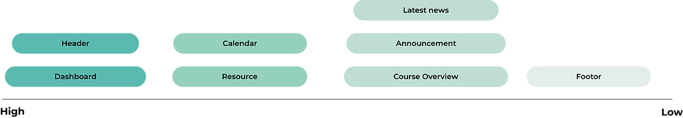
To improve the user experience of Moodle CCA, I have decided to begin with a UI deconstruction. This will help me gain a better understanding of the information architecture and composition of the website. After breaking down the interface into individual sections, I also launched a top 3 features voting amount 50 classmates to help me identify my main focus points of redesign.

Vote of Frequently Use Feature
Zone1
Header
This section includes notification, search, message icons, and a personal profile page entry and menu and school logo.
Zone2
Dashboard
This section consists of a calendar and My Courses, which shows the courses in which the student is enrolled for the semester
Zone3
Zone4
Blank section
Announcement
This section contains General Announcements,Faculty Announcements and Student Announcements
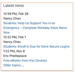
Zone5
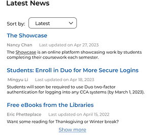
Latest news
This section lists recent important news from the university according to the time of publication. Each news contains a title, date, and publisher name
Zone6
Resources
This includes third-party softwares that students would normally use, and has a search box. Each third-party software has logo and name
Zone7
Course overview
This section summarizes the classes taken each semester, all of which can be found here
Zone8
Calender
This section is the calendar, which shows the assignment submission time
Zone9
Footer
This section includes student’s name, home page, log out and app download guide
Insights
Top 1
Dashboard

The different course portals are the most frequently accessed by students
Top 2
Header
Top 3
Resources

The most popular parts of this section are the message icon and the notification icon.

The different course portals are the most frequently accessed by students
-
interface text a lot, it is difficult to discover the desired function
-
is not balanced, there are a lot of white spaceInterface layout
-
It is difficult to immediately locate the desired function.
-
the most often utilized pieces occupy little area
-
lack of shortcut keys, cannot enter one's own courses rapidly
Heuristic Evaluation
In order to identified usability problems, I did a rating and evaluation on current interface based on the Heuristic Principles.
Lack of Visibility of system status

-
The block color’s indication is unclear to user. No one can tell when it's time for class or if there is a due date for an assignment.
-
Also, user can not tell what day is today and which day is already passed through the calendar.
-
The course status of each lesson is not directly visible in any of the three forms of Course Overview.
Lack of Visibility of system status

-
The search symbol is present but there is no search box; you must click on it to bring up a search box so you may do a search.
-
Typically, clicking the header will take you to the profile, but in this instance, doing so will open the dashboard once more and display some redundant features.
Lack of Visibility of Consistency and standards
-
The boundaries between each item are not very clear, unlike the division lines in announcements.

-
Both have the same search bar, yet they have different design languages.
User interview
To obtain user feedbacks on this platform, I conducted interviews with a variety of students in CCA. During the interview process, I recorded feedbacks from different students and organize this feedbacks downbelow.

Findings
& Insights
It can be summarized into three main parts: Usability, functionality, and Visual.
When considering the design of the website in terms of Usability, Functionality and Visual, the following issues were identified.

Usability
Functionality
Visual
-
Unclear navigation structure makes it difficult for users to find the content they need.
-
Uneven page layout font size and overcrowded text make the page difficult to read and navigate.
-
Uneven page space distribution.
-
Page colors do not match the school's representative colors and do not have the school's identity.
-
Interaction design is not intuitive, making it difficult for users to understand how they should interact with the site
-
Some features, such as search boxes and information boxes, are not obvious, hard to find and not easy to use
-
The website lacks information related to the actual school situation, such as courses, schedules, school calendar, and event information
-
Lack of detailed information, such as lack of instructor profiles, textbooks, course outlines, etc.
-
Website design is not modern or attractive enough
-
Page layout is confusing, with unbalanced blank areas and segments that make users feel uncomfortable or distracted
Redesign Priority Metrix
After analyzing the students' click rate on this page, it has helped me understand the priority of different functions that need to be redesigned.
Redesign
Process
Wireframe
After conducting the analysis of the school's original website, I proceeded to redesign it. As part of the redesign process, I created three wireframe designs, each with a different layout. The first wireframe design had no navigation bar, the second had a small sidebar, and the third had a floating navigation bar. These designs were intended to test the effectiveness of each layout in enhancing the user experience and improving overall website functionality. Through these wireframe designs, I aimed to optimize the website's layout and ensure that it meets the needs and expectations of its users.

Description:
This version does not have a navigation bar. Instead, it features a banner at the top that can display the scenic views of the school.
Pros:
-
Clean and simple interface, work smoothly when scrolling up and down
-
The pages are ranked according to how often the students use the different features. It is more in line with students' needs.
-
The absence of a navigation bar allows users to navigate the entire page, so they don't miss any information.
Cons:
-
The lack of a navigation bar allows students to go directly to the page they are looking for.

Description:
Version 2 uses the side navigation bar design. The top header contains other essential functions such as search.
Pros:
-
The sidebar makes this page easier to navigate to each content that students need.
-
The largest display on the main page is My Course.
Cons:
-
Sidebar and header have a little conflict, does not look good enough.
-
When scroll down to the end of the page, the header will overlap with the footer
-
The current design of this version seems to be lacking in aesthetic appeal and may appear too cluttered to the user.

Description:
Version 3 is a homepage with a floating navigation menu design, and all areas in this version are designed with rounded corners, making the page look more cute and relaxing.
Pros:
-
Rounded corners make students feel more minimalist
-
Clearly defined zones
Cons:
-
Sidebar and header have a little conflict, does not look good enough.
-
The current design of this version seems to be lacking in aesthetic appeal and may appear too cluttered to the user.
Iteration
Based on the analysis of the previous three wireframes, I ultimately decided to move forward with Version 1 due to its superior design and functionality. Subsequent to selecting this wireframe, I conducted several iterations to refine its details and optimize its performance. Through this iterative process, I was able to further enhance its usability and user experience, ensuring that the final product would meet the highest standards of quality and meet the needs of its intended users.
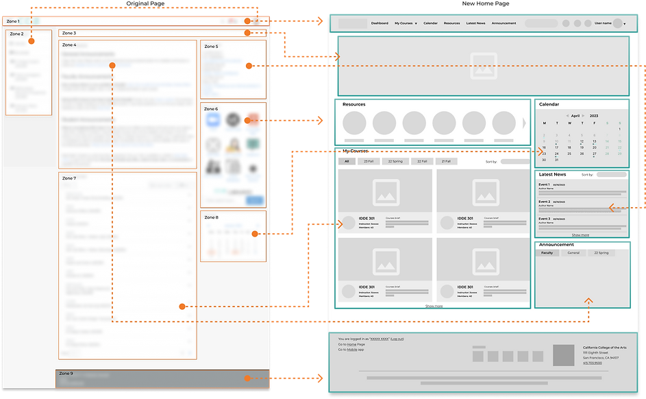
Zone 1 & Zone 2: CCA logo, Search bar, Notification, messages, user profile.
Zonc 3: Blank space
Zone 4: General Announcement, Faculty Announcement, Student Announcement. No valid information was provided.
Zone 5: Contains time, author and information.
Zone 6: Third-party apps, CCA libraries search bar.
Zone 7: Courses with title and name
Zone 8: Dates with marks
Zone 9: Home, the way go to mobile app, log out button.
Changes: Merged the features in zone1 and zone2 together, and make it into a clear header with function navigating button. This area will fixed on the screen while users scrolling down.
Changes: Change the original blank space into a carousel banner that shows the campus sceneries or pics of big ongoing events.
Changes: Reduced the size of the original footprint and sorted it according to the frequency of use by students. Added category feature to make users find what they need more quickly.
Changes: According to the frequency of use of the students moved to the relatively back of the page, increased the sort by function, easy for users to find the news they want
Changes: It was moved to a prominent position according to the students' frequency of use, and the original icon table was changed to an icon carousel.
Changes: Changing the text format of mycourse to an icon format allows students to better identify the class they are looking for based on the course name and image, and adds the ability to sort by semester so that users can locate the course they are looking for faster.
Changes: Markers are added below the dates of important events, each with a different meaning, and the content is displayed when the mouse hovers over the marked date.
Changes: Added school information and contact information to allow users to quickly contact the school.
Key Feature Iterartions
In the process of drawing the high-fidelity interface, I drew the key featuer as high-fidelity effects and iterated over each one. And in the green box is the final design.

Cons:
-
Don't know what each point means
-
The whole layout is rather crowded
Not clear on what day it is

Cons:
-
The overall font size lacks specification
-
Sort by search box is outside of the whole area and does not agree with the whole
-
The division area between each new is unclear

Cons:
-
Cannot view announcements in all categories
-
Crowded layout
-
Each message is not clearly spaced

Cons:
-
The semester switch is not simple and beautiful enough to present all semester categories
-
No way to know the course progress

Cons:
-
There is no place to indicate some holiday closure or important notice
Cons:
-
Sort by on the left side is not beautiful and useful enough

Cons:
-
It is unable to know how many kinds of announcement there are without opening drop down

Cons:
-
Semester switching is not simple and beautiful enough


Redesign
Process
To ensure that the design is standardized and I have designed the visual system.


Final Design
After confirming the design system, I designed the final interface, and carried out the next level of design for the clickable part.


